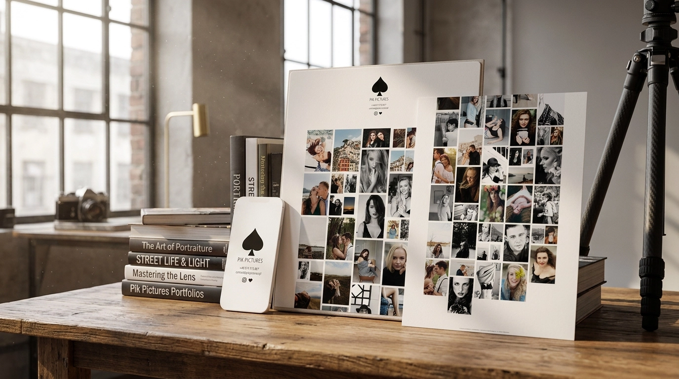
PikPictures photographer website - photo portfolio
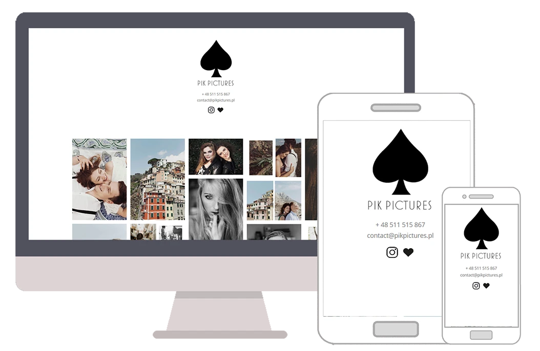
Project: a photographer website for PikPictures, with a minimal layout, photo gallery and offer presentation.
Challenge
The photographer website for PikPictures had to give priority to the photos. In this type of project, a strong interface quickly competes with the portfolio, while visitors should judge the frames, not decorations.
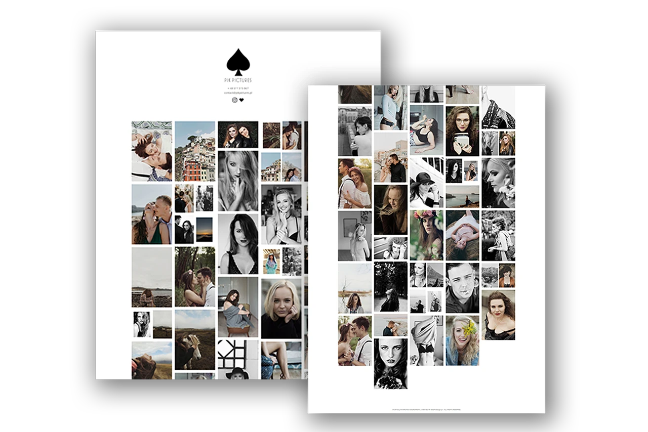
The gallery had to show work in strong quality without losing browsing comfort. This matters especially on mobile, where photos are often viewed first.
Solution
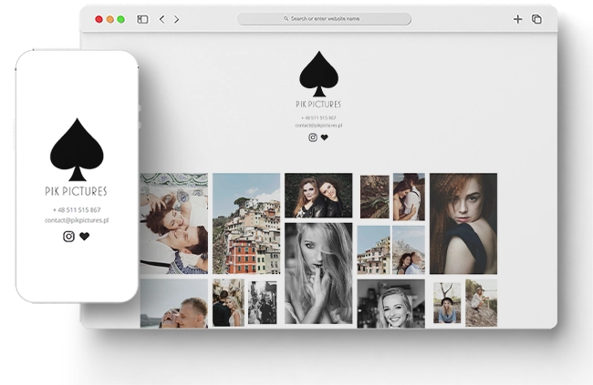
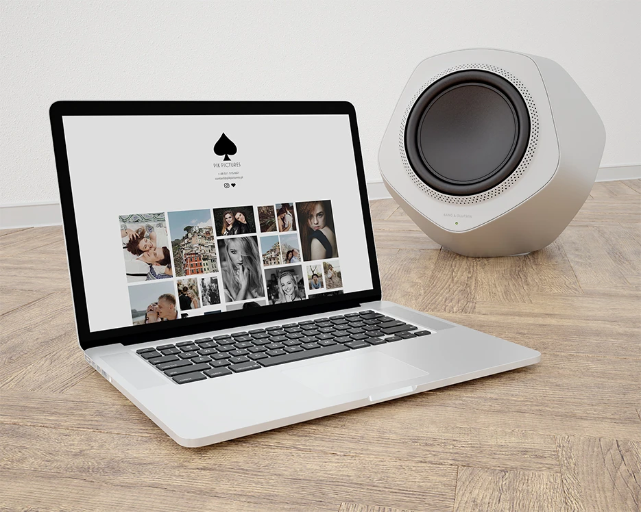
I designed a minimal WordPress website where the photos are the main element. The layout gives them space and limits elements that do not help the decision.
The offer and contact are present, but they do not cover the portfolio. Visitors can first see the photographer's style and then move to an enquiry.
Website colour palette
The palette is neutral so the photos can lead. Light backgrounds and navy structure the site without forcing their own mood onto the photography.
Fonts used in the project
A geometric typeface that gives structure to headings and guides the eye through sections. In this photographer website project, it separates the offer, facts and calls to action.
A readable typeface for descriptions, lists and forms. On mobile, the copy stays light, so visitors can move through the offer without friction.
What PikPictures got
The outcomes of a portfolio website that presents photos without visual noise.
in the foreground
without excess effects
comfortable on phone
for a website quote
Technology stack
Tools and technologies used to build the website.
Like this project?
Let's see what I can do for you.
Every project starts with a short conversation - tell me your idea and I'll come back with a specific quote within 24h. No obligations, no vague talk.
Similar projects

Want a similar project?
I'll build you a website or store tailored to your brand and goals. Quote within 24h.