
Massage studio logo - Piasek Edenu
Project: a massage studio logo, business cards and signage for Piasek Edenu, inspired by the calm of the Far East.
Challenge
The massage studio logo for Piasek Edenu had to suggest relaxation and an oriental character without going so far that the design became decorative clutter. The mark had to fit a place where clients come for calm.
The logo also needed business cards and signage. The same style had to work in a client's hand, on the studio door and in simple information materials.
Solution
I built the mark around a calm combination of green and gold. Green points towards nature and harmony, while gold adds elegance without a heavy luxury tone.
Using the logo as a base, I prepared business cards and signage. Contact details were organised so clients could quickly find the phone number, address and service range, not just look at a nice graphic.
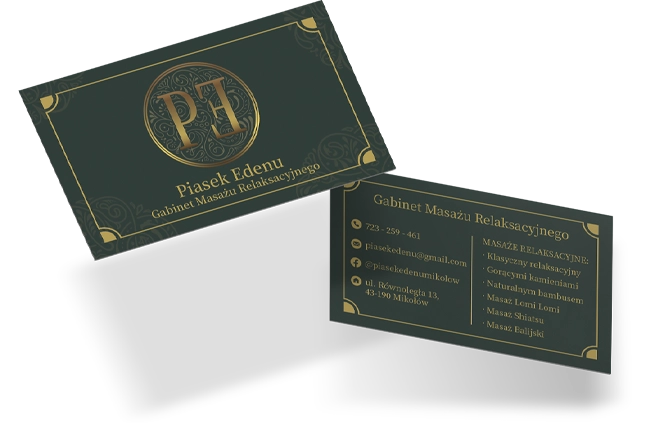
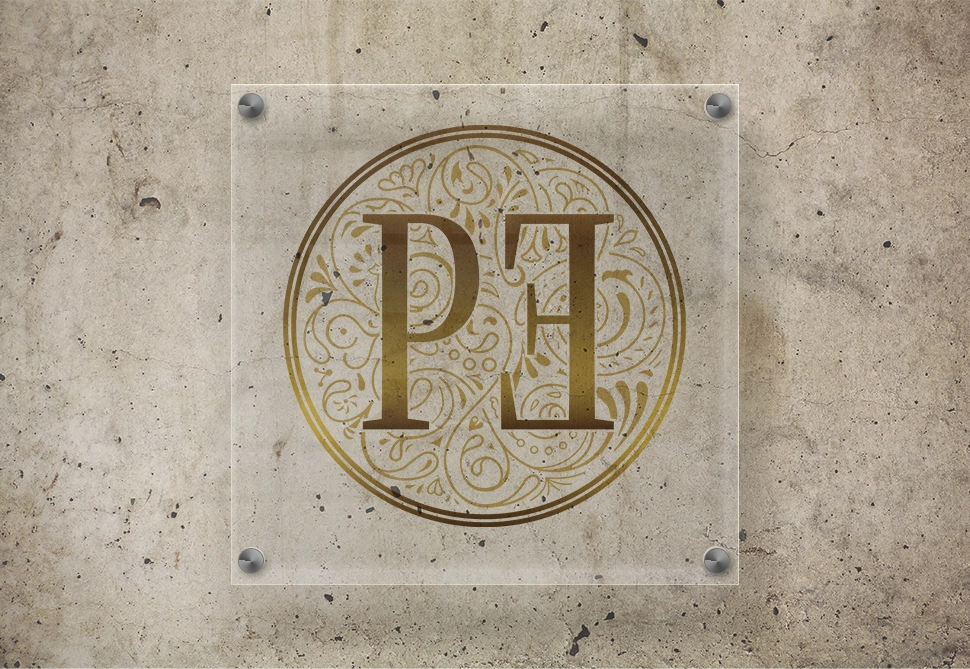
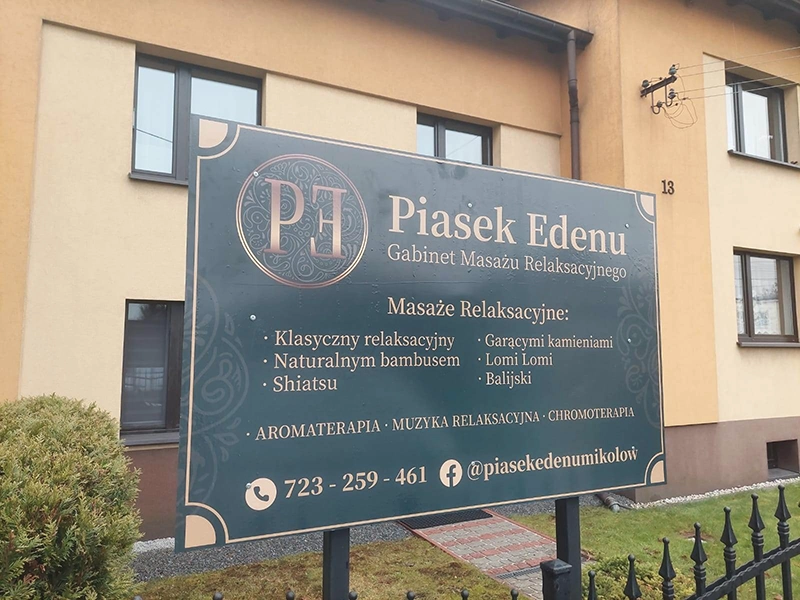
Materials for the studio
The package covered the mark and the basic media a client sees before the visit and while contacting the studio.
A calm and elegant palette
Green carries the natural, calm tone, while gold creates a sense of a refined service without excess decoration.
Typography for a calm brand
A classic typeface that fits the elegant, oriental direction without heavy decoration.
A simple font for information that must be readable straight away on a business card.
Files delivered
A file set prepared for the agreed channels: print, web or social media.
File note
The exact file set depends on the project scope, print supplier and where the materials will be used later.
Logo and print preparation
The project required vector versions and files ready to hand over to a print supplier.
Like this project?
Let's see what I can do for you.
Every project starts with a short conversation - tell me your idea and I'll come back with a specific quote within 24h. No obligations, no vague talk.
Similar projects
Want a similar project?
I'll design a consistent set of promotional graphics - for print and online. Quote within 24h.