
Poster for an ice cream parlour - Lody Pingu
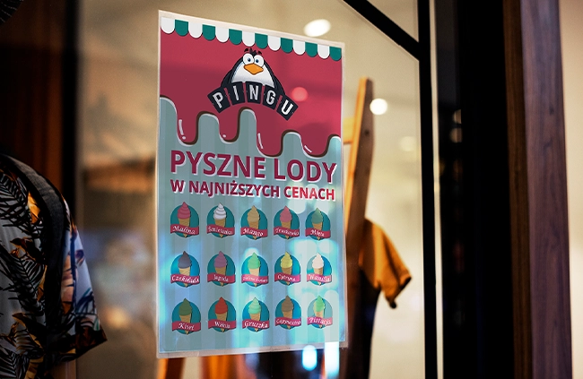
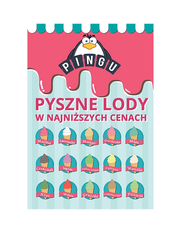
Project: a poster for Lody Pingu, prepared as a contest design promoting the ice cream parlour and its offer.
Challenge
The poster for Lody Pingu had to encourage people to come in and instantly show the light, summer character of the brand. In a contest design, the first impression matters because the poster competes with many signals around the venue.
The biggest risk was making the composition too sweet. With ice cream, it is easy to use too many colours and extras, which weakens the message.
Solution
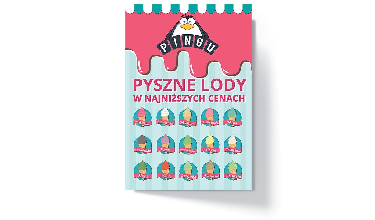
I prepared a poster built around a simple, appetising frame and a clear layout. The colours suggest ice cream and summer pleasure, while the text hierarchy stays readable.
The project was prepared as a material for print and presentation. This makes it possible to judge it both as a contest poster and as a real promotional medium for the venue.
Poster scope
The project focused on one medium, but was prepared so it could be presented and printed.
Ice cream parlour colours
Light dessert colours build an appetising character, while a darker accent keeps the text readable.
Poster typography
A strong typeface for short headings and messages that need to be noticed quickly.
A readable font for descriptions, contact details and materials that also need to work at a smaller size.
Files delivered
A file set prepared for the agreed channels: print, web or social media.
File note
The exact file set depends on the project scope, print supplier and where the materials will be used later.
Poster design
The material was prepared as a print design and contest presentation.
Like this project?
Let's see what I can do for you.
Every project starts with a short conversation - tell me your idea and I'll come back with a specific quote within 24h. No obligations, no vague talk.
Similar projects

Want a similar project?
I'll design a consistent set of promotional graphics - for print and online. Quote within 24h.